Portfolio
Your personal trading dashboard. Track overall performance, spot trends, and understand where profits and losses come from.
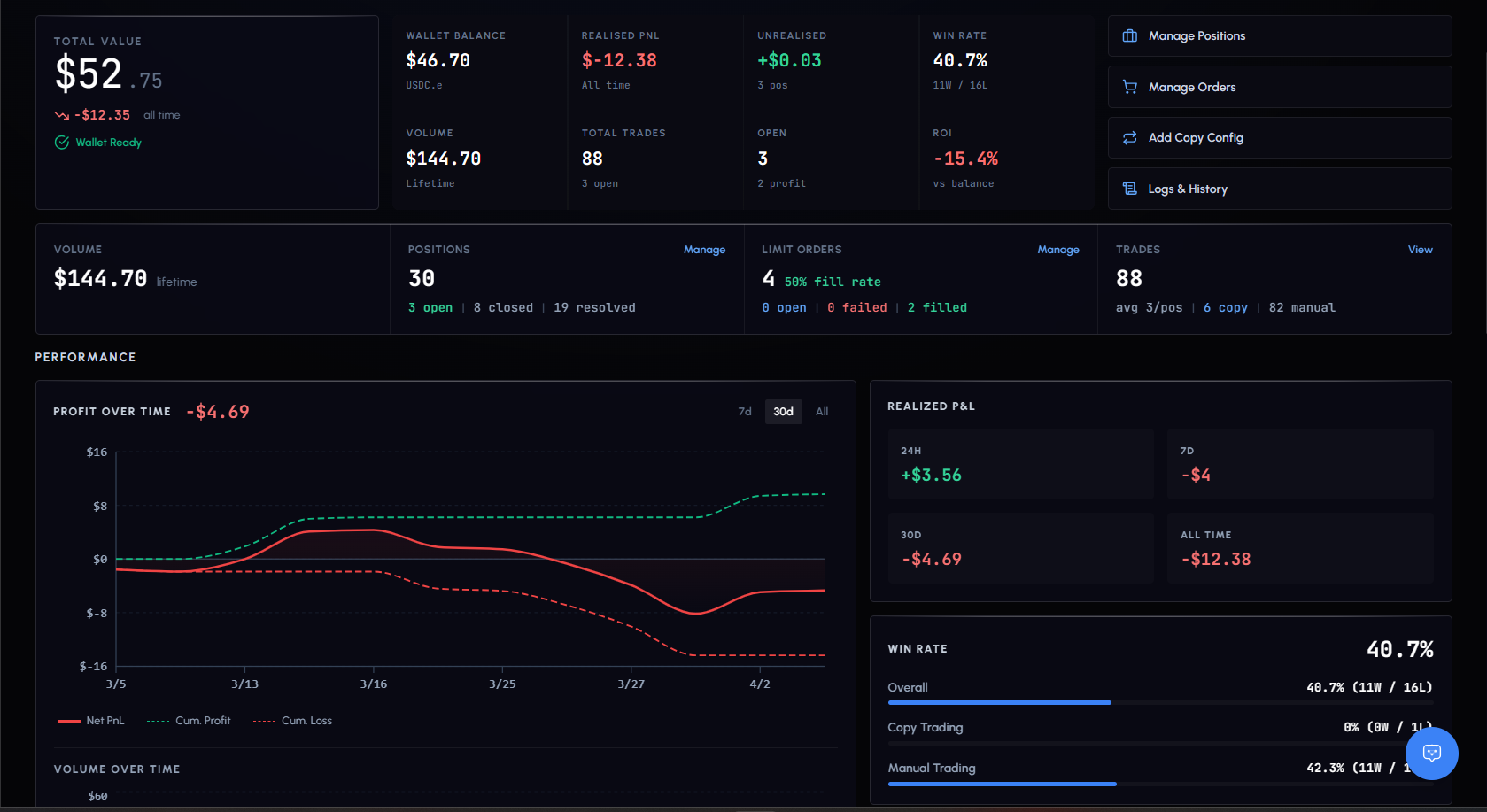
Summary Stats
| Metric | Description |
|---|---|
| Net P&L | Total profit or loss across all trades |
| Win Rate | Percentage of profitable trades |
| Total Volume | Combined USDC value of all trades |
| Total Trades | Number of trades placed |
| Open Positions | Count of currently active positions |
| Resolved Positions | Count of settled positions (won, lost, closed) |
P&L Chart
Interactive area chart showing cumulative profit and loss over time.
- Green area: positive P&L periods
- Red area: negative P&L periods
- Hover for exact date, net P&L, cumulative P&L, total profit/loss, and trade count
Period selector: 7d, 30d, All
This is your equity curve. Steady upward slope = consistent growth. Sharp drops = drawdowns worth investigating.
Volume Chart
Bar chart showing daily trading volume. Hover for exact date, volume, and trade count. Use it to spot your activity patterns.
Trading Heatmap
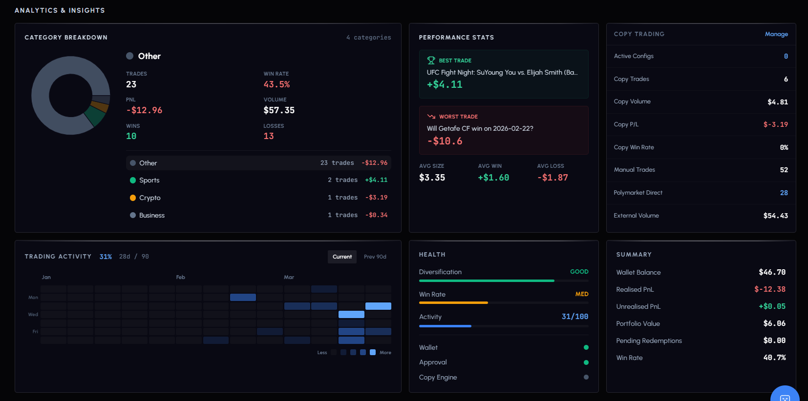
Calendar-style grid showing 90 days of trading activity. Each square is one day.
- Darker squares: more trades that day
- Lighter squares: fewer trades
- Empty squares: no activity
Hover any square to see the exact trade count for that day. Helps identify consistency and patterns.
Category Distribution
Pie chart breaking down your trades by market category: Politics, Crypto, Sports, Finance, Entertainment, Science, Business.
Shows where your trading is concentrated. Over-exposure to one category increases risk.
Paper vs Live
Portfolio respects your Paper/Live toggle. Switch between them to compare paper performance against real results.
Both modes show the same charts and metrics, but calculated independently.